Context:
Team:
Role:
Timeline:
Deliverables:
FLEXJOBS
A UX Case Study + Redesign
FlexJobs (flexjobs.com) is a job board for vetted remote and flexible work opportunities. The website is subscription-based, paid for by the job seekers. These paying users are the focus of this project.
Research
Challenges
Solutions
Competitors

Key Findings


User Comments
Empathize
Users


Ideate
Plan to Address the Issues

Design
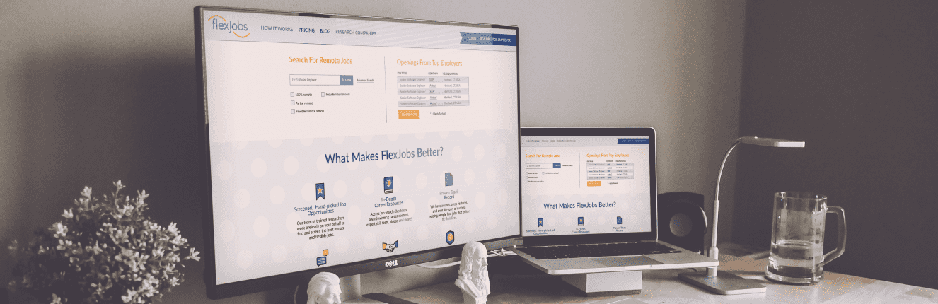
Home Page
The home page has been reorganized to prioritize a direct job search, more in alignment other popularjob search websites.
The user’s journey will begin by experiencing some of what the website has to offer for free, before they need to subscribe and pay. However, the pricing information is now disclosed on this front page.
At the top, there are now two columns — one for searching by typing in a specific query and one for browsing by job openings by the top employers on the site.
Viewing information about the top companies is a priority because the Flexjobs Value Proposition is that the website lists only legitimate, hand- selected job opportunities.
The short blurbs of information, illustrating the benefits and basics of using Flexjobs reamain; however, these are not hyperlinks as it is meant to be an overview only. There is a call-to-action immediately following this information for the user to make the decision to sign up, after having looked over the benefits.


Top Employers Page
This page holds a list of the top employers that have been vetted by Flexjobs and offer flexible and/or remote work opportunities.
Rather than displaying many badges next to each employer to show every one of their accolades, an asterisk is displayed next to employers that meet a certain level of prestige.
More in-depth information about how these employers rank, should be on another page, cleaning the list up for the user to scan without as much visual noise while still disclosing the information for those interested.
Pricing Page
This page discloses all of the pricing tiers upfront, showing transparency.
This page can now be accessed from the main navigation, rather than buried several steps into the sign up process. The information has been flipped so that the numbers are front and center and the justification for paying these amounts are immediately below.
There are several calls-to-action to make signing up quick and easy once the user decides he can afford the prices.
